Hello friends and fellow flip enthusiasts!!
I am pleased to announce our first house has now been listed as of August 8th!
It was a big final push, but it's done. Things all crossed off the list done. Yay! What a good feeling, after 2 1/2 years of working weekends, evenings and well, a lot in-between. We finally have Saturdays again for family outings! Boy, am I excited about this.
I have divided these Finale blog postings into two parts, since there are so many good "after pics" to share! Part I will include the front exterior and downstairs portions of the house. Part II will go over the upstairs portions and back of the house. I'm looking forward to sharing the upstairs bathroom, since that is the space that is the most newly finished with a custom surprise!
I would love to go back and detail all the finishing touches we did in the past 6 months, but with an infant and a move, I'm not sure I can! So, I leave you with the final product. Along the way, we can take a few side steps onto memory lane, just for comparison sake. :D Here we go!
For the funsies, here is a "before" pic from 2011:
 |
| (copyright says 2012, but we bought the house Jan 2012, and agent's pic must have been taken summer before) |
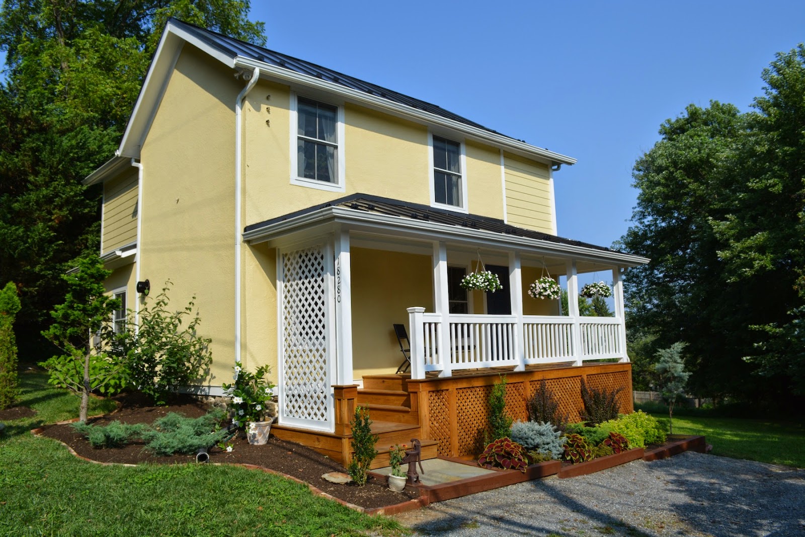
Now we see this:
 |
| Yes. yes, it is. |
And a few detail shots of the front:
 |
| front landscaping all spiffed up-Mom trimmed the shrubs |
Mom re-stained the landscaping beams.
We got the exposed stone foundation re-pointed:
 |
| Shnazzy! :) |
I am particularly pleased about how the front porch turned out. I had to fight for my design choices--white opaque stain instead of translucent!! I thought this was important to relate to the window trim and fascia.
The decking and front lattice were painted a clear wood sealer. This enhances the look of the wood. I love how it looks!!
Around the side of the house to the left:
The bricks that we used to line the mulch beds are original to the house--they were part of the brick fireplace
Moving around the right side of house:
Dad worked on building the door under the front porch, and Mom coordinated/carried out this landscape plan, with the angled brick detail, plantings and slate pavers.
And here is the crawl space door that Dad built:
Ok. Lets move inside. We will revisit the rest of the exterior at the end.
Starting with the foyer :)
The window chalkboard hook art in the entry is something I did to incorporate an original window from the house. I cleaned it up, painted a coat of polyurethane to seal up any lead paint, and added hooks for some functionality. Then, I painted chalkboard paint on the panes for an added pop.
Next we have a before/after comparison of the stairs:
And a before/after of the under stair storage door:
The stairs is located in a different place in the home for this comparison, but you can still see how I tried to relate the two of them with the slats and cross beam supports. Also note that the new door was made from leftover heart pine slats.
Here is a view of the foyer detailing the fixture. We used Edison bulbs for this one to add to the character of the space.
This is the foyer from the living room:
Next we come into the living room all shnazzed up.
A true "before" shot of the corner where the fireplace is now:
Since we couldn't salvage the existing location of the fireplace, we moved it over to the corner where the furnace was and used the existing venting opening for our gas fireplace.
This is the exact same angle, as a true "after" shot:
This next one might be my favorite of all. The sexy fireplace. :)
 |
| LOVE IT!!! |
And another "before" showing the stair-stack in the throes of demo. The stairs were part of the original 1890's section of the home. The bathroom addition (the door shown at the left of the picture is where the bathroom had been added on) is on the east exterior wall:
This next "after" pic shows the stair-stack moved to the east exterior wall instead of being in-between the bathroom and the main living space.
Our design includes a full bathroom "under" the stairs, tucked away efficiently in the "core" of this space.
This "before" shot shows the old porch full of heart pine flooring that we took out of the house.
This next "after" shot presents the heart pine flooring extending all the way through the living room and dining room, peeking into the kitchen.
Here are couple additional detail shots of the living room space:
The fireplace mantle--
This piece of thick dimensional lumber is an old floor joist from under the old kitchen/dining room space.
And a "pretty-pretty" just for fun. My dear friend Hannah just got married and I was able to collect some of her succulent decorations that didn't have roots and save them for such an occasion as this. :)
Next, we have a segway from the living room to the dining room space.
I don't have good "before" photos of the dining room since the room was so dark--the windows were boarded up at the time and the electrical didn't work.
So I introduce to you the newly finished dining area:
 |
| from the living room |
 |
| from the kitchen |
Angle shot showing the sewing table, antique desk and dining table.
Next we see the door to the utility closet which houses the HVAC system, cabinet and electrical box. The goal is to have the homeowner tuck their T.V. components into this closet.
This bowl of eggs on the dining table was my initial color inspiration :)
 |
| muted palette of cream, beige, tan, chocolate brown and pale blue |
This view of the dining room shows the section of kitchen countertop with the pot rack above that is intended for extra dining room storage--kind of like a buffet.
And now, for the piece de resistance, the kitchen!!! My personal favorite space in the house. Most probably because I designed it. Well, it was mostly me---I had my trusty husband who let me bounce ideas off of him on occasion.
Let's start with the design vision drawings:
And then the design fruition!
Another comparison from a different angle:
Love these!
And one more:
Not exactly the same angle, but it will do.
Stainless steel appliances:
 |
| Range/oven/microwave |
 |
| Dishwasher/Refrigerator |
Remember these cabinets? I'm glad we replaced them. ;)
Remember this sink? I'm glad we replaced it. ;)
Remember how the water heater used to be in the kitchen? Well I'm glad it's in the crawl space now!
We extended the kitchen into the covered porch space (you can see the porch door above), and reworked the improper foundation and roof.
Both of these images are looking due east.
Finishing up the kitchen images, I have a couple remaining pretty-pretties:
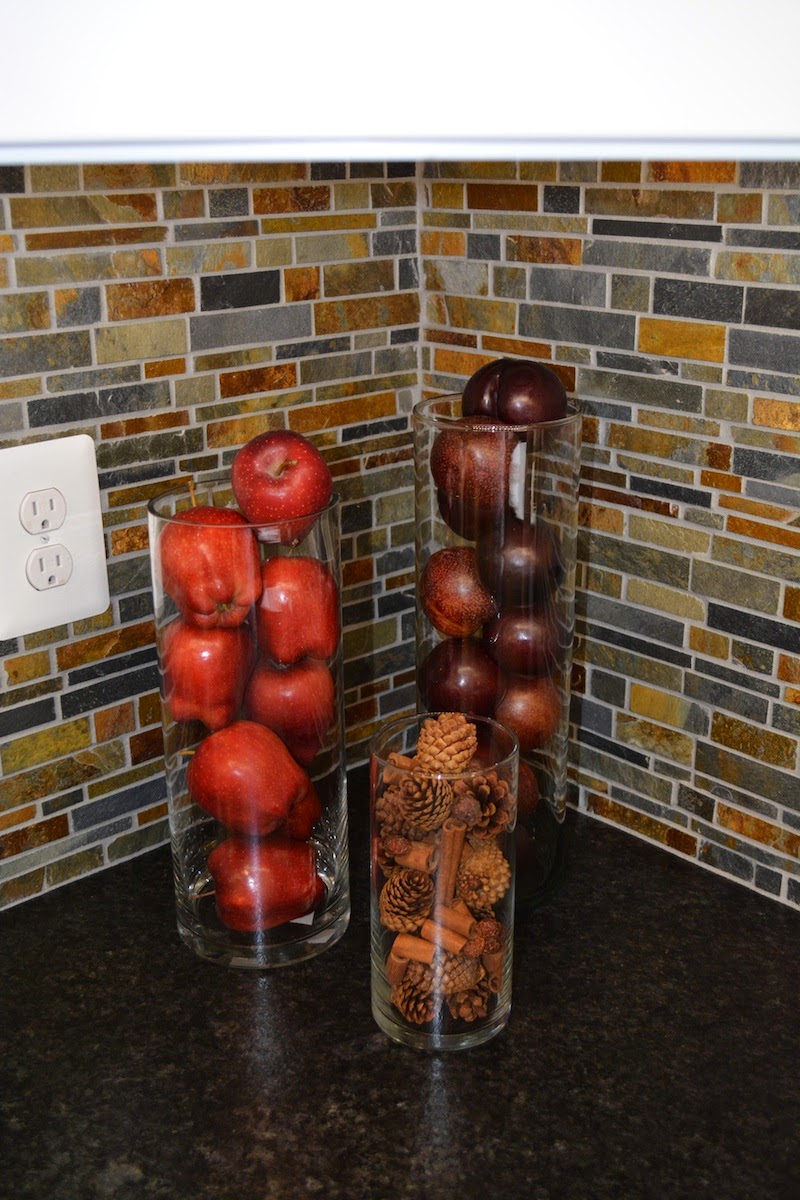
I really like this backsplash. It comes in 12" X 12" sheets, interlocking so as to look like a seamless installation.
The granite is not to be ignored as well--it is an "antiqued, leathered" finish to lend itself with the matte appearance of the slate natural stone. I just love this.
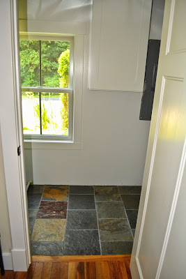
Now for a brief look into the utility closet, which houses the HVAC and electrical box. Slate tile has been laid in here pretty recently. This is the only window facing west.
It was so rewarding to take out all of our tools in order to stage!
I added this antique, primitive tool box I found at a yard sale, just for fun.
Now for the final room on the lower level right before ascending the stairs.
This bathroom is tucked away under the stair-stack with the door visible from the front door. It's really quite small, but surprisingly, it doesn't feel as so.
This is what it looks like as you open the door.
Next is a "before" shot of the downstairs bath, which had been the only bath in the whole house, so it was rather large. (it had only been a bathroom since the 1980's--before that it was a bedroom!)
Here is a close up on the vanity & mirror. With the fixtures in this room, I wanted to give a nod towards the Victorian era it was born out of.
And the loo--
With a shot of *most* of the window. :P
Now we see the shower stall, which is to your left as you enter the bathroom.
Lastly, I will detail the stairwell.
Looking up, looking down
And a few more "before" and "after" juxtapositions:
Looking down...
Looking up...
Here we see the 2012 version of Gabe looking down at us.
A mite better, wouldn't you say?
Thus commences Part I.
Stay tuned for the rest of the house tour, including not yet seen footage of the upstairs bathroom.
:D
Dun dun dun.....


No comments:
Post a Comment